I decided to change the paint color for the main floor of my house. The current paint color would have been fine as it’s a newer home, but it’s flat paint and my children aren’t kind to it. I hate how hard it is to wipe down. So when I repaint, I want to add character to the house without being so much character that people go “ew” when they walk in.
1. The couches are black. 2. Dining room curtains. 3. Family room- I want to keep all the colors in there (carpet, painting, built ins, etc) 4. Kitchen 5. Picture in our dining room.
I’m going to share their recommendations with your because I thought the detail and care they took was wonderful. I’m sure they have some pretty standard go-to colors and such, but I felt like they were really trying to help me as an individual. Having had some negative experiences with other companies’ customer service recently, it was a nice change. When I spend money, I want to feel valued as a customer. They made me feel valued before I even spent money.
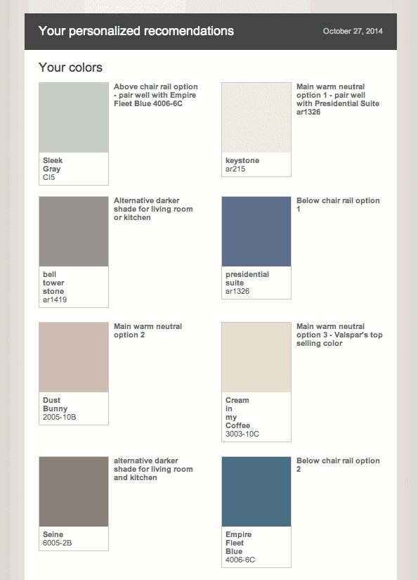
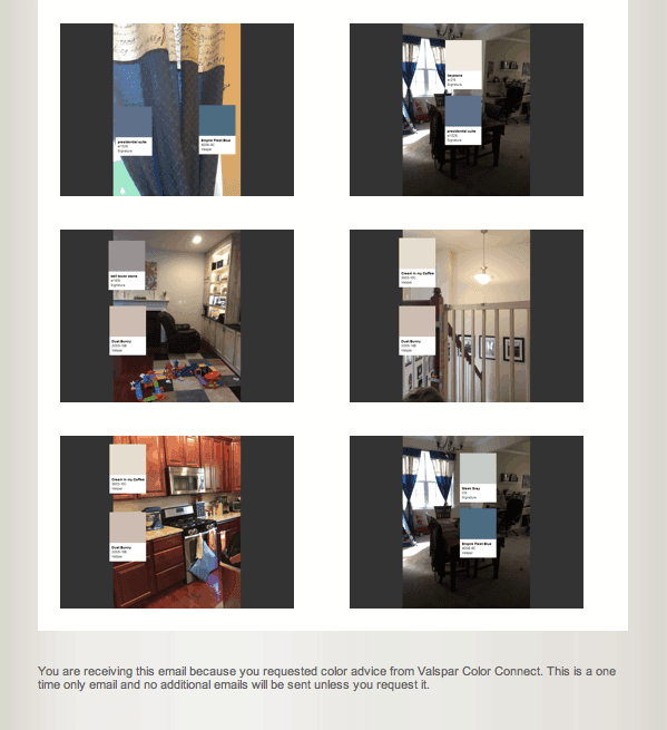
First, she sent me this detailed letter with photos:
Dear Danielle, What a lovely home! I also love your color choices on the curtain as well. It has nice balance of warm and cool shades. Since this is a large project, I would like to recommend selecting one main color first and layering additional colors. My suggestions are warm neutrals like Keystone, Cream in My Coffee, or Dust Bunny. These neutrals are flexible and versatile and keep your space look open and light. Then the blue color below the chair moulding can be more matching to the curtain with Presidential Suite or just keep the color more warm with Empire Fleet Blue and pairing with a gray like Sleek Gray CI5. This will make the space differentiated without making the space feel too cold. I also added bell tower stone and Seine. Both colors are mid-tone taupe where it will finish up the kitchen space. I often recommend colors that are not too light compare to cabinet colors to keep the space more harmonious. If your cabinet wood tone has more red in it, I highly recommend Seine or Cream in my Coffee to bring down red tone of cabinet. It’s all about balancing the color so one color doesn’t dominate the space. You can find these colors at your local Lowe’s store and you can also explore options and collect color samples at the store.
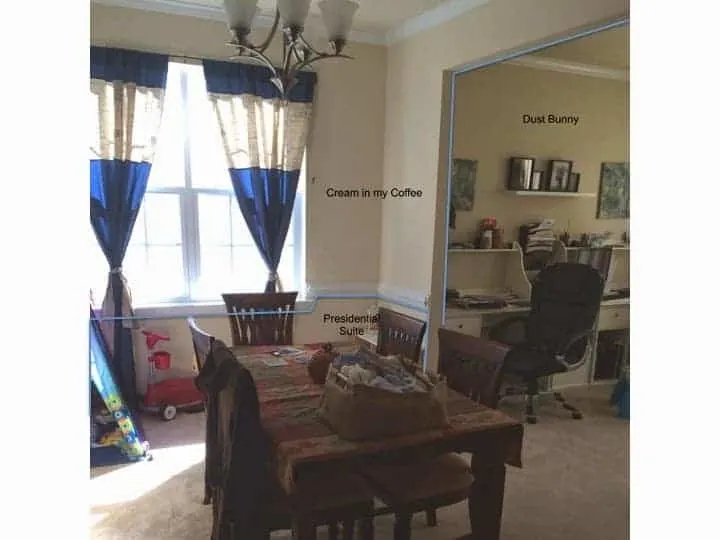
I asked her how to paint different colors she’d suggested with an open floor plan and she sent me back a picture of my home with the outlines for what colors go where! (Happy dance!)
I also got this explanation:
I apologies for not clarifying the color application for rest of space.
Most fail proof way is the use Cream in my Coffee rest of space and use Presidential Suite below the chair rail. If you you want to add different color for different rooms, you can pick up different color and pick up where the new wall starts. As an example, I see that there is office right next to blue curtain room. You can end Cream in my Coffee at the opening wall and start another color on the other side of wall. See attached file.
If you don’t have any distinctive wall separation, I would recommend continuing a color to the corner of space and apply send color picking up from adjacent wall.
I hope this helps and pleas let me know if you have any additional questions.
Regards,
Sue
Valspar Color Consultant
I’m still up in the air about what my final choices will be, but I’ll definitely be posting an update once everything is painted!
What are your favorite colors for my house?! Would love to hear more opinions!

